STAy & PLay for Staples
Repositioning Staples beyond office supplies as a creative support system
When everything you need is on a screen, why walk into a store?
This project reimagines Staples as a creative support system for making ideas real.

PROBLEM
More services,
less meaning.
Staples responded to pressure by expanding — business solutions, tech services, shipping. But expansion without a clear identity made the brand blurrier, not stronger.
This isn't about Staples losing to a competitor. It's about a specific customer — the creative professional — no longer knowing what role Staples plays in their workflow.
1986
Founded as the original office supplies superstore
2010s
Amazon drives closures and restructuring
Today
Expanding into business services without a clear identity to anchor it
RESEARCH
Every competitor
owns one dimension.
Nobody owns both.
Mapping the competitive landscape revealed a clear gap.
Convenience players had no craft.
Craft players had no scale.
Digital tools had no physical output.
Key finding
"Nobody owns the moment where digital work becomes physical output — with confidence, not anxiety."
01
Nobody visits with creative intention
Visits are reactive. Not purposeful. Not with a project in mind.
02
The physical moment is irreplaceable — just underserved
Printed boards, bound portfolios, framed proofs still need to exist physically. No digital tool completes them.
Design Process
I proposed a Figma-like tool using Staples stationery — Post-its, pens, notebooks — as digital objects. The feedback was one sentence:
"We already have Figma. Why would we use Staples?"
I couldn't answer that. I was trying to pull Staples into the digital world, instead of asking what Staples can do that digital fundamentally cannot.
First instinct
A digital stationery tool
Bring Staples' products into a Figma-like workflow. Pull Staples onto the screen.
The better question
What can't the screen do?
The one moment a file must become physical — still irreplaceably physical. Nobody has designed around it.
First idea & feedback
Reframe
Move Your Idea
"How might we give creative professionals the confidence to move from digital to physical — without anxiety?"
Staples isn't a place that sells tools. It's the space where a creative idea stops living on a screen and becomes something you can hold.
solution
STAy & PLay !
One brand.
Two connected layers.
One seamless loop.
The name carries the entire concept. The three decisions pointed to the same structure. A digital layer that meets the customer before arrival. A physical layer that receives them. A single bridge moment that connects them invisibly.
Visual Identity
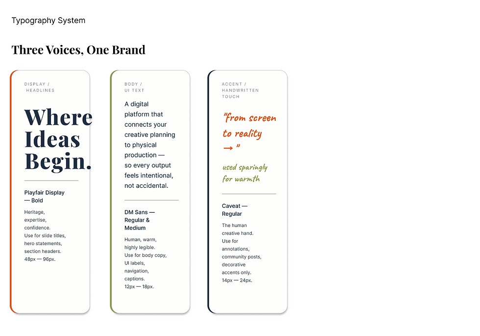
Brand system
A brand that looks like the moment it owns.
Every visual decision reflects the reframe — not a stationery store, not a tech retailer, but the confident bridge between screen and physical.


Experience Design
Maya's journey
Maya represents the core target — a creative professional who regularly bridges digital work and physical output, and who currently experiences the most anxiety at that transition. Her specific anxiety around color accuracy is what led to the Calibration Station as the core insight.
Major consideration flow
7 screens. 2 bridge moments. 1 loop.
Environmental Design
STAy & PLAy Studio
Four zones.
Each mapped to a waveline failure point.
Not a redesigned Staples store — a creative studio that happens to have Staples' capabilities. Each zone addresses the journey's lowest emotional moments.
REFLECTION
Strategy before aesthetics
Every visual decision that held up was made after the waveline analysis. The orange came from understanding what red said wrong. Every good aesthetic decision was a strategic conclusion first.
The feature
that became the thesis
I didn't know the Calibration Station was the centre of this rebrand when I started. The waveline revealed it. Real design problems rarely announce themselves — you have to map your way to them.
Restraint is
a design decision
Every deliverable had to answer: does this serve the moment when a screen file becomes physical? If not, it was out. Scope discipline is how a concept stays sharp.
Let’s turn hidden patterns
into clearer experiences.
hyok911@gmail.com
San Francisco, CA
© 2026 by Hyokyung Ma.